Work / Interface and UX
Quartz Navigation Redesign
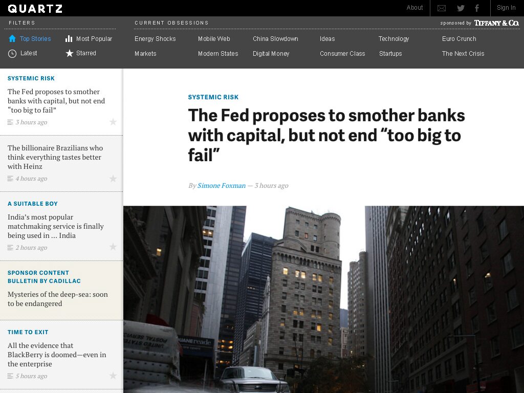
New navigation for qz.com on desktop and tablet, aimed at readers who arrive from links and social, not the home page.
Quartz was one of the first news sites to publish one HTML5 codebase to web and mobile, with no separate app. It had about two million readers a month and wanted more. Editor Kevin Delaney asked us to redesign the left menu, top nav, and the “Obsessions” bar for tablet and desktop.
The problem
- Low engagement with the existing navigation.
- Readers didn’t understand features like “Top” stories and “Obsessions.”
- Screen space used poorly.
- Brand presence had to stay strong.
Goals
- Simplify navigation without losing the look.
- Make Obsessions clearer and more used.
- Design for side-door traffic, which was more than 90% of visits.
- Make the important stories easier to find.
Process
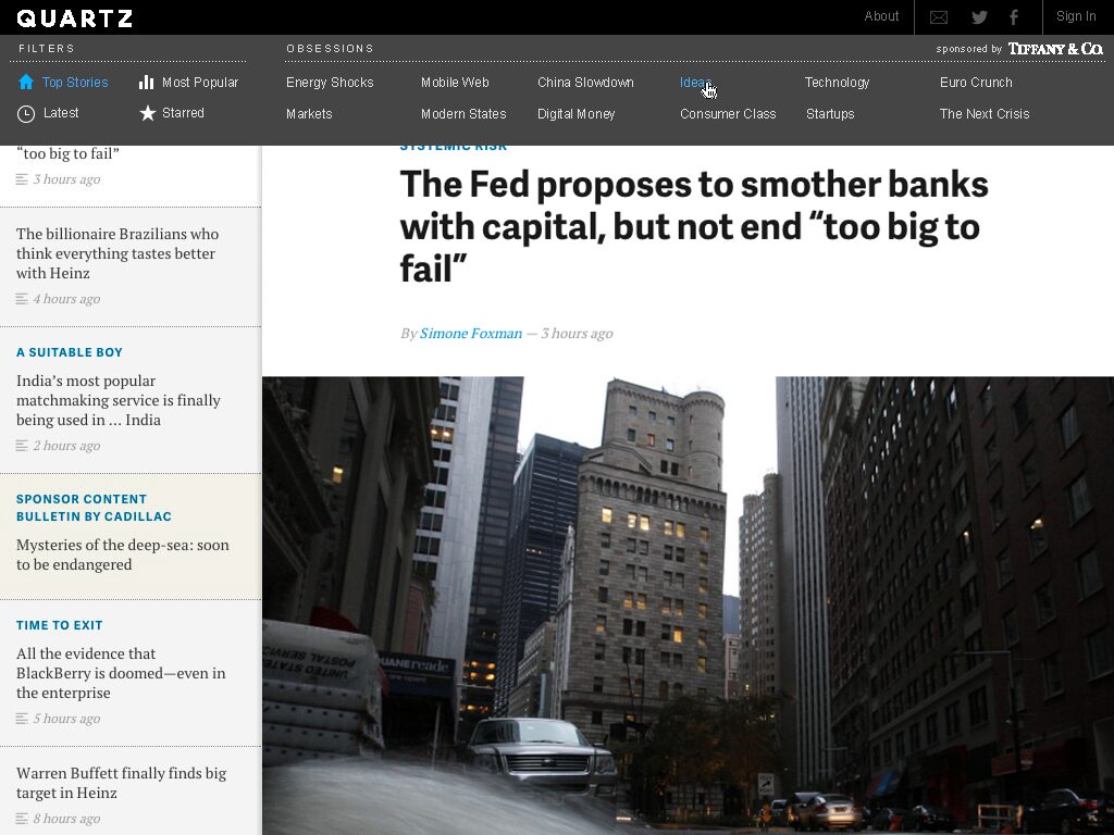
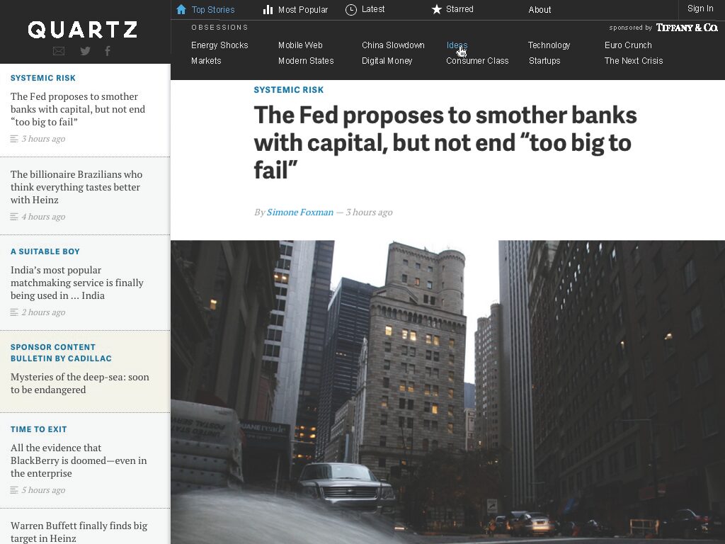
We first showed two layouts: one horizontal, one stacked in two columns so Obsessions could grow. The client chose horizontal. We then built high-fidelity HTML and CSS mockups of button placement and rollovers, and took feedback directly on the posted comps.

Reception
From the client the morning after launch: “…we rolled out the new desktop and tablet designs last night and the response this AM has been nothing but supremely positive.”
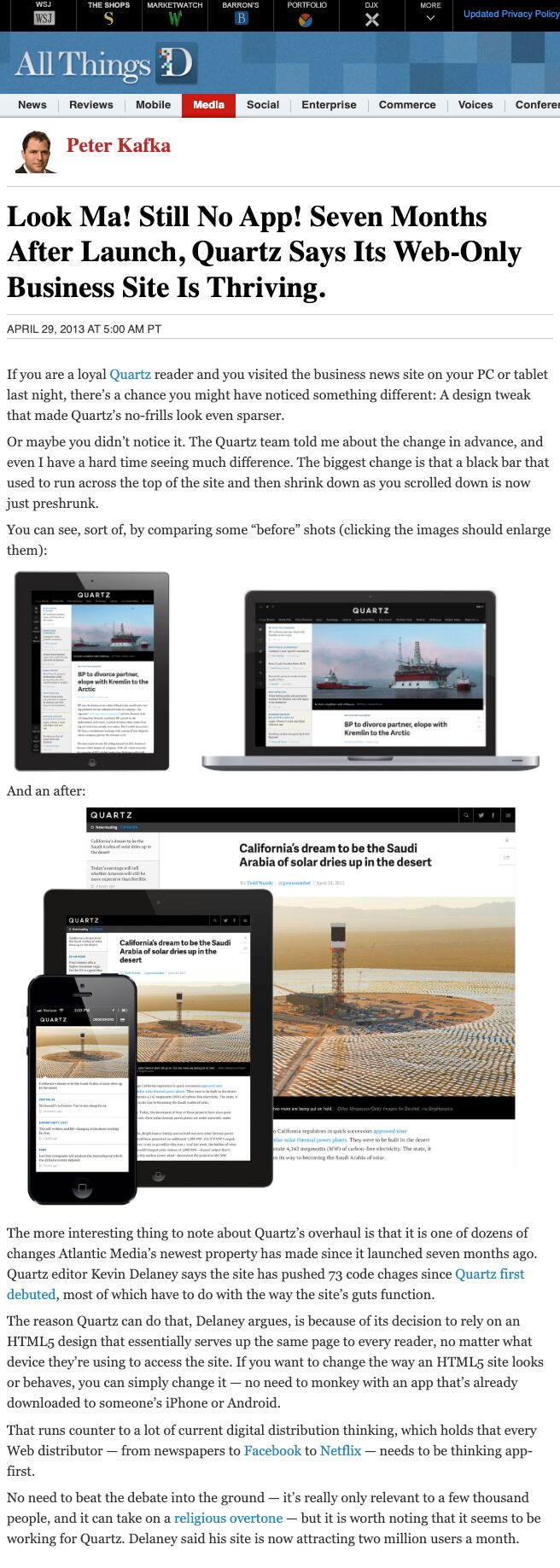
Peter Kafka wrote about it on the Wall Street Journal’s All Things D the next day.